History and Origin
Prussian blue was the first modern synthetic pigment and has a fascinating history. Berlin. Early 1700s. Colormaker Johann Jacob Diesbach - working for Johann Leonhard Frisch (an academic/scientist) - was experimenting with the oxidation of iron. He was mixing a red dye, which called for potash, ferric sulfate and dried cochineal. The potash he used was tinged with blood and caused an unexpected reaction. The result was a compound known as iron ferrocyanide, which gave a very particular blue color instead of the expected red.
The commercial potential was quickly realised. Until that point the popular deep blues came with their own issues. Ultramarine blue was expensive - made from precious lapis lazuli stone. Indigo was quick to fade. The knowledge around Egyptian blue had been lost. This meant that rich deep blue was often reserved for religious pictures, particularly images of the Virgin Mary.
The new Prussian blue was stable, affordable, non-toxic and relatively lightfast. It was discussed in letters between Frisch in Berlin and the president of the Prussian Academy of Sciences, Gottfried Wilhelm Leibniz, in Hannover 1708-16. Frisch claimed to have improved on the pigment manufacture and soon began to sell it across Europe as Prussian Blue. Artists were impressed and inferior copies were marketed to capitalize on the demand. Frisch and Diesbach’s production methods remained confidential for around 20 years but once the secret was out, new producers popped up all over Europe. Some experimented with animal flesh, horn, hair, skin and hooves in place of the original dried blood.
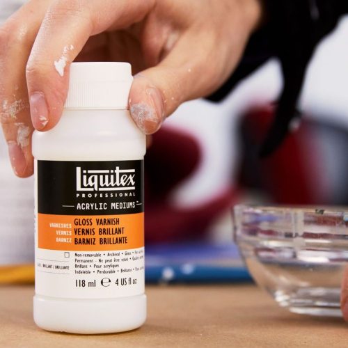
Today, Liquitex uses a mixture of three pigments rather than the original pigment and this is all due to chemistry. Prussian blue pigment is sensitive to alkaline substances and acrylic binders are alkaline. The pigment needs a binder of pH7 or less and this just isn’t compatible with an acrylic polymer emulsion. You’ll find the pigment happily sitting in watercolors, oils and printing inks because their binders - linseed oil and gum Arabic - are acidic.
Prussian Blue Hue in Practice
Prussian Blue quickly found a use as a textile dye and is still used in the industry today as Iron Blue. It was the blue in the blueprint process - the commercial photocopying process invented by Herschel in 1842. It’s now used as a commercial printing ink around the world. Prussian blue’s potential for use in medicine and science is currently being explored. Today it’s a life-saving treatment given to patients with radiation sickness. It also holds some potential as an active material in batteries and as an electrocatalyst for fuel cells.
Where can it be found in art history?
Its dense tint made it ideal for rich Rococo scenes. One of the first uses of Prussian Blue can be found in paintings including the Entombment of Christ by the Dutch artist Pieter van der Werff. Watteau used it for his Paris paintings such as Pilgrimage to Cythera in 1717. Thomas Gainsborough was another great fan of Prussian blue - as were Monet, Constable and Lowry. In the 19th century the pigment was imported to Japan and became the go-to blue for their woodblock prints. Katsushika Hokusai used it in his iconic seascape The Great Wave Off Kanagawa, mixed with traditional indigo to produce subtle water gradations. The 19th century photographer Anna Atkins used the light-sensitive nature of the pigment to create her ground-breaking plant cyanotypes. And Prussian blue was a key part of Picasso’s Blue Period: bringing a melancholy feel to his works painted between 1901-04.
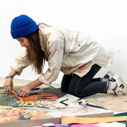
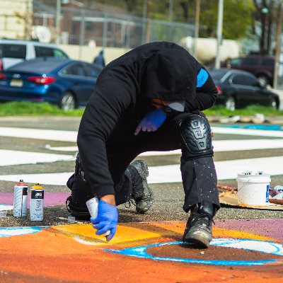
How can you use Prussian Blue Hue?
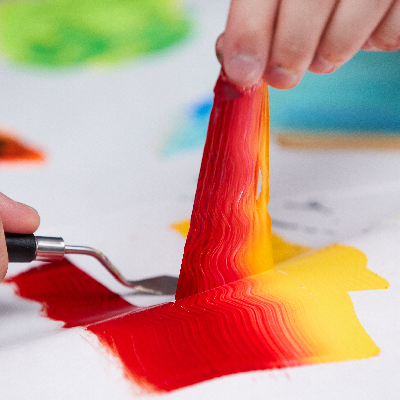
It’s ultra versatile and pretty intense. Prussian Blue Hue is a color with a high tint power so go gently when mixing. Great when you want to work in a restricted chromatic palette without sacrificing intensity. Try it as an over glaze with other colors. Use it for skyscapes, water, botanicals, fabric… or simply get lost in its inky blue depths.
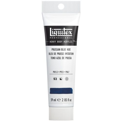
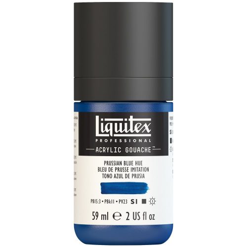
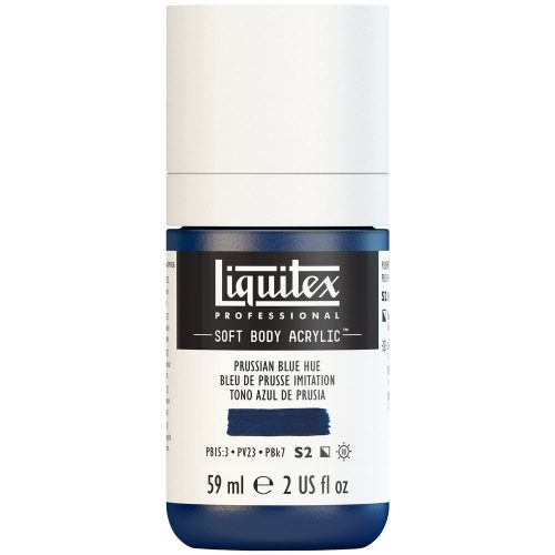
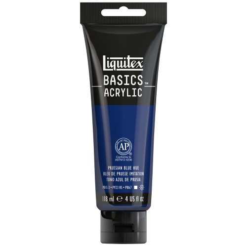
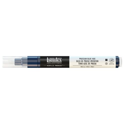
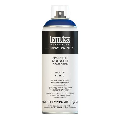
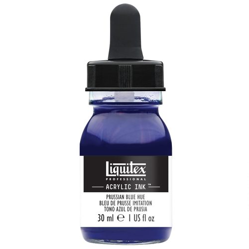
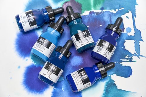
Find Prussian Blue Hue in Liquitex Professional Heavy Body Acrylic, Soft Body Acrylic, Acrylic Gouache, Acrylic Ink, Acrylic Marker, Spray Paint and Basics Acrylic Color.